In 2024, responsive web design is crucial due to the dominance of mobile traffic and the need for excellent user experience. It ensures that websites adapt seamlessly to various devices, providing a consistent and user-friendly experience. With over 60% of global web traffic coming from mobile devices, responsive design enhances navigation, improves load times, and boosts readability. It also offers benefits like cost efficiency, better SEO performance, and future-proofing against new devices. Embracing responsive design is essential for reaching a wider audience and maintaining a competitive edge in today’s digital landscape.
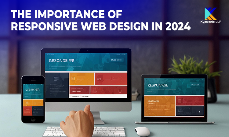
Responsive web design (RWD) is an approach to web development that ensures a website's layout, images, and content adapt seamlessly to different screen sizes and devices. Rather than creating separate sites for desktop and mobile users, a responsive design allows one site to serve all devices, adjusting its layout based on the user's screen size and orientation.
One of the most compelling reasons to prioritize responsive web design is the dramatic increase in mobile traffic. According to recent statistics, over 60% of global web traffic now comes from mobile devices. This shift is driven by the widespread use of smartphones and tablets, making mobile-friendly websites essential for reaching a vast audience.
In 2024, the trend of mobile-first indexing by search engines has become even more pronounced. Google, for instance, primarily uses the mobile version of a website for indexing and ranking. This means that if your site isn’t optimized for mobile users, it could significantly impact your search engine visibility and organic traffic.
User experience (UX) is a crucial factor in the success of any website. A responsive design directly impacts UX by ensuring that users have a smooth and enjoyable browsing experience regardless of the device they use. Here’s how responsive web design enhances UX:
Consistent Design Across Devices - Responsive design maintains a consistent look and feel across all devices. Whether a user is accessing your site on a desktop, tablet, or smartphone, they will encounter a unified and coherent design, which builds trust and improves the overall user experience.
Improved Navigation - On mobile devices, users often face challenges with navigation due to limited screen space. Responsive design addresses this by offering optimized navigation elements, such as collapsible menus and touch -friendly buttons, ensuring users can easily find and interact with your content.
Faster Load Times - Mobile users are particularly sensitive to load times. A responsive website ensures that images and content are appropriately scaled, leading to faster loading speeds on mobile devices. According to Google, a delay of just one second in page load time can result in a 7% reduction in conversions, making speed a critical factor in UX.
Optimized Readability - Text readability is enhanced in responsive design by adjusting font sizes and spacing based on the device. This prevents users from having to zoom in or scroll horizontally to read content, which can be frustrating and deter them from engaging with your site.
Implementing responsive web design offers several key benefits beyond improved user experience:
When adopting responsive web design, keep the following considerations in mind to ensure optimal results:
As we navigate through 2024, the importance of responsive web design cannot be overstated. With the continued rise of mobile traffic and the emphasis on user experience, having a responsive website is essential for maintaining a competitive edge in the digital landscape. By adopting responsive design principles, you can ensure that your site delivers a seamless and engaging experience for users, regardless of the device they use. Embrace responsive web design to enhance user satisfaction, improve SEO performance, and future-proof your digital presence in an increasingly mobile world.
At Kyptronix LLP, we specialize in crafting responsive and user-centric websites tailored to your business needs. Our expertise ensures that your online presence is optimized for all devices, helping you reach a broader audience and achieve your digital goals. Contact us to learn how our responsive web design solutions can elevate your brand and drive success in the digital age.